Silver and photography have a traditional link. Because silver is the most reflective metal, its compound, silver nitrate, reacts to light and darkens depending on its intensity. In this way, making the film light sensitive silver has been used in photography for years. However, the age of digital photography made photo films redundant, which led to a rapid decline of the use of silver for this purpose.
In spite of this affinity photographing silver jewellery is a real challenge. The same high reflectivity produces glares which can completely distort the image. The better polished a piece is, the trickier is the photographing of it.

 I love high-polishing and highlighting my jewelry, especially pieces with 3D patterns. A photograph taken form a wrong angle spoils the whole impression. Look at these two cats: the one on the left looks quite unimpressive, while the one on the right wears the proud look, very typical of a cat. It also has a more clear silhouette. The whole trick is: if you can’t avoid glares, it’s better to have them at the right spot so that they accentuate the shape. Here is an example how glares can create an interesting color effect: the silver earrings look bi-colored, while on picture 4 it is clear that they are plain sterling silver.
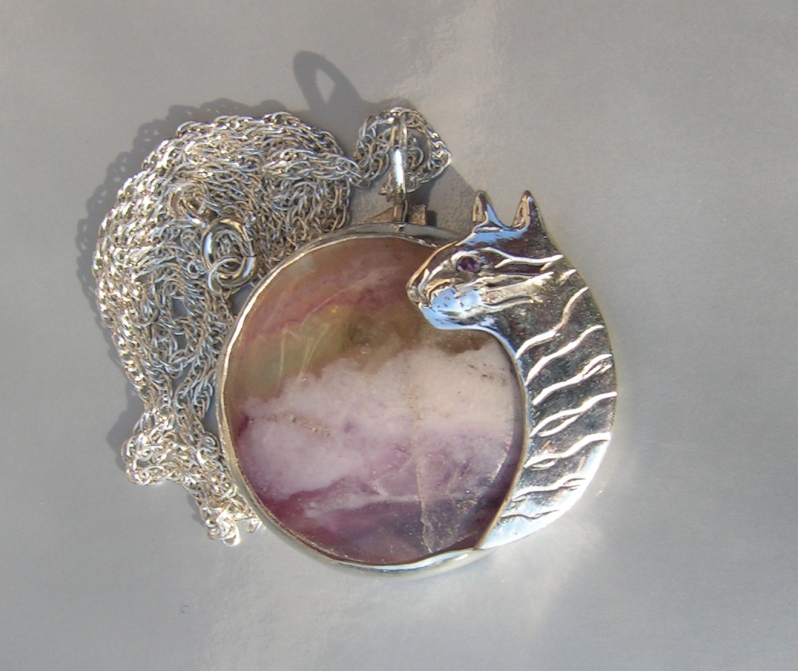
I wish I could use these great professional pieces of advice when taking pictures of this very special pendant. I will certainly consider it in the future. What I usually do, is quite simple. I just shoot – as many pictures as possible. Digital photography allows to do it without wasting precious silver-layered photo film. I shoot from many angles, exposing the piece to different types of light: from direct sunlight (which is usually not a good idea) to dimmed artificial light. The best time for shooting is early morning on my east-facing balcony. Using different backgrounds can also be helpful. Black might look chique in a jewelry store, but dimmed white is much better for online shops. The piece needs to have enough contrast with the background, while the latter must not distract attention from the piece. These are quite simple rules, but they have to be tested and applied in practice.
After the shooting is done, I select a couple of top shots. The best way to do it is to use a ‘medium’ or ‘large-size’ icon view, which allows to see at a glance which pictures show the piece in the best possible way. After that I open the pictures in Microsoft Photo Editor, rotate, crop and resize them. Above that no editing is done, since manipulating the color creates wrong impression. It is better to post additional pictures if, for instance, the piece has a stone which changes color depending on the light.
There is still so much to learn about photographing silver jewellery…to be continued
Natalia
Thanks for visiting my blog:)
I can see you write also in Ru on your other site, are you Russian?
Groetjes
zilvera
Hoi Natalia,
Ik kom zelf uit Rusland/Oekraiene, en ga toevallig ook over een week – via Kiev – naar de Krim, waar ik ben opgegroeid.
Kom je uit Kishinau?